Cases
Real cases, law by law
37 situations where a law from this catalog shows up in a real product, with what happened and why. As close to a real scenario as I could get without making anything up; if you have a better case, write to me.
These are the same blocks that close each law page, gathered here to be read in sequence, without the theory in between. One of the 38 has no case, because I did not find one that held up.
Attention and response time
The button that missed by a pixel
A case of the Fitts’s law

BetaWiki · via Wikimedia Commons · Domínio público
In Windows 95, the Start button sat in the bottom left corner of the screen, and a screen corner is the best target there is, because the cursor cannot go past the edge. The hand can throw the mouse over there without aiming. Except that the button had a dead pixel along its left and bottom edges, and clicking exactly on that pixel opened nothing. Jensen Harris, from the Office interface team, recounted in 2006 that this produced a surprising number of lost clicks, and that the Windows team fixed the pixel before Windows 2000. One pixel turned the easiest target on the screen into a small, distant target, which is the slow case of the formula. A button flush against the edge needs to respond all the way to the edge, otherwise the advantage of the position becomes a trap.
The ninety seconds Netflix has
A case of the Hick–Hyman law
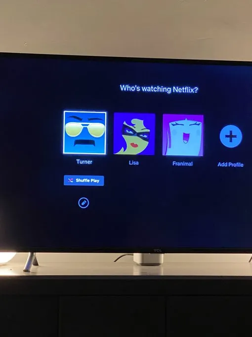
Netflix · photo published by TechCrunch, 28 April 2021 · Uso editorial
Two Netflix executives wrote, in 2015, that the company’s research suggests a limit for whoever is choosing what to watch. After sixty to ninety seconds, having looked at ten to twenty titles, the person loses interest, and the risk of abandoning the service rises considerably. The recommendation system exists to fit within that budget, and the same authors estimate that it is worth more than a billion dollars a year to the company. Netflix’s research puts a number on this law. The more similar options there are, the more expensive it is to decide, and the only way out is to reduce the set to be compared. In 2021 Netflix took this to the limit with the “Play Something” button, which starts playing a title based on the viewing history without asking for any choice at all. The ninety-second number comes from internal research, with no published method, and holds as an order of magnitude. The question it leaves for your product is how long the person can bear choosing before they leave.
Four hundred milliseconds, measured at Google
A case of the Doherty threshold
In 2009 Google deliberately delayed the results page for a fraction of people, by between 100 and 400 milliseconds, for six weeks. A 400-millisecond delay reduced the daily number of searches per person by 0.44% in the first three weeks and by 0.74% in the following three. The effect grew with exposure time and did not vanish when the delay was removed. In the five weeks after the delay was removed, the group still searched, on average, 0.21% less than the control group. Four hundred milliseconds is not much time, and even so it changes how much the person uses the system, and the lost habit does not come back the moment the speed does. The experiment measures real latency, not the feeling of response a progress indicator gives, so it supports the first half of the threshold and leaves the second as good practice. Slowness charges even when nobody complains about it.
Twenty-three fields to pay
A case of the Cognitive load theory
The Baymard Institute has been measuring e-commerce checkouts in the United States for over a decade. The average flow shows 23.48 form elements by default, when an ideal flow fits into twelve to fourteen. On the other side of the ledger, 17% of people who abandoned a purchase said the reason was a checkout that was too long or too complicated, and the average cart abandonment rate, across fifty studies, is 70.22%. The 17% comes from people stating the reason, not from a controlled test, and the figures are from September 2025, because Baymard updates the series. The theory shows up there at market scale. The screen asks for almost double what the decision requires, and the difference shows up as people who give up before paying. It is worth counting the fields in your form and asking, of each one, whether it changes anyone’s decision.
The card number in blocks of four
A case of the Miller’s law
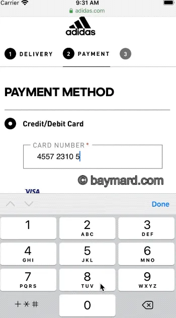
Baymard Institute · Credit Card Number Field: Auto-Format Spaces · Uso editorial
In the Baymard Institute’s tests, whoever types in the card number tends to copy it in the format in which it is printed on the plastic, in groups of four, and checks it block by block before submitting. When the field inserts the spaces on its own, the check works, because the screen and the card show the same blocks. When it does not, the person types the spaces themselves and some sites return an error because of it. Sixteen digits in a row do not fit in anyone’s working memoryThe mental space where the person holds what they are using right now. It holds about four things, and they fade in seconds if they are not used.See it in Memory →See in the glossary →. Four blocks of four do. In 2025, 15% of e-commerce sites still did not format the spaces, against 50% in 2019. What the law describes is exactly this, grouping what needs to stay in the head for a moment. It does not describe the size of a menu, although it is cited that way all the time. A menu is recognition, not recall, as Jakob NielsenWrote the ten usability heuristics and created the heuristic evaluation method that this site treats as triage, not as a test.4 references in this work:199410 usability heuristics for user interface design2000End of Web Design2009Short-term memory and web usability1990Heuristic evaluation of user interfacesSee in the bibliography → wrote in 2009, and it does not need to fit into seven.
Visual perception and organization
The hole closest to the name was not the candidate’s
A case of the Law of proximity
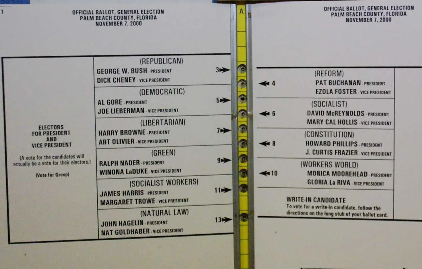
Condado de Palm Beach, cédula oficial · via Wikimedia Commons · Domínio público
In the 2000 presidential election, the Palm Beach ballot, in Florida, listed the candidates in two columns with a single row of holes in the middle. The first hole was Bush’s, first name on the left. The second was Buchanan’s, first name on the right. Gore, second name on the left, corresponded to the third hole. Whoever read the left-hand column from top to bottom concluded that the first two holes were Bush and Gore, in that order. Buchanan received 3,407 votes in the county, and the study estimates that at least two thousand people who meant to vote for Gore voted for him by mistake, in an election decided in the state by 537 votes. The ballot had arrows linking each name to its hole, and the arrows lost to distance. In a form laid out in columns, proximity is read before the arrows and the labels.
The drill and the real alert on the same list
A case of the Law of similarity
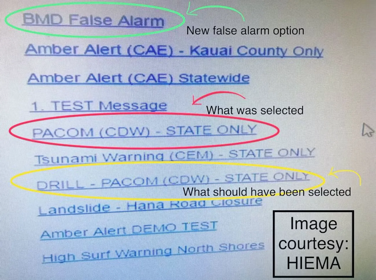
HI-EMA · image released by the state, via Hawaii News Now · Uso editorial
On 13 January 2018, an operator at Hawaii’s emergency management agency sent the entire state a ballistic missile alert during an internal drill. The FCC report describes the screen. The real alert template sat on the same drop-down list as the test template, with the same appearance, and the confirmation that followed only asked whether they were sure, with the same message for both cases and without showing the text that would go out. The FCC compares this with what other vendors do to separate test from production, such as a watermark, a different colour and a real environment hosted separately. The agency attributes the episode to human error combined with inadequate safeguards, and the interface was one of the safeguards that were missing. Two options that look the same promise the same consequence. When the consequence is the opposite, similarity makes the operator pick the wrong line, which is what happened here.
The race that ended up inside the instructions column
A case of the Law of common region
Broward County Supervisor of Elections · official sample ballot, via Ballotpedia · Registro público da Flórida
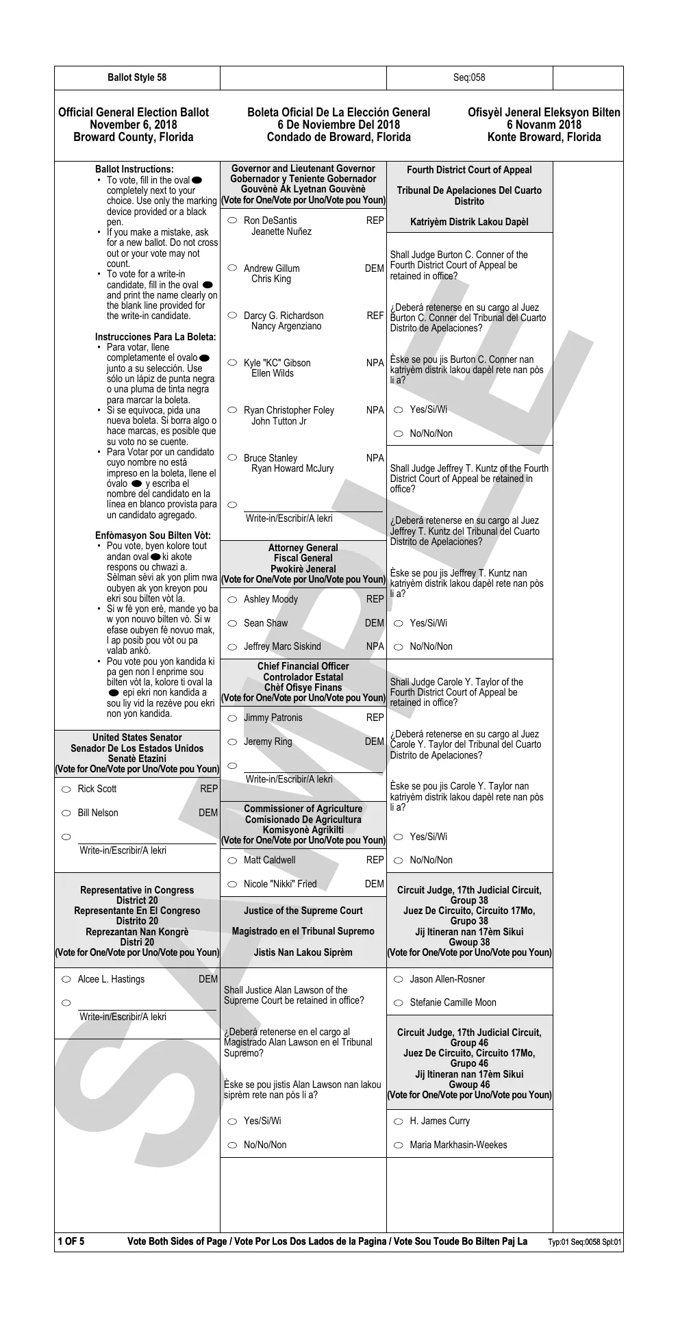
On the Broward ballot, in Florida, in 2018, the first column carried the voting instructions in three languages, and the Senate race sat beneath them, inside the same column. The other races started in the middle column. A 2007 federal guideline already advised against that arrangement, because in testing voters skipped whatever came right after the instructions. That is what happened. Statewide, 1.10% of voters left the Senate blank, against 0.64% for governor, and Broward, with 8.8% of the votes, concentrated about a third of those blanks. The election was decided by 10,033 votes, and the study’s authors do not claim that the ballot decided it. What they show is common region at work. The column is a box, what is inside it is read as part of it, and a race inside the instructions column became an instruction for whoever was reading fast.
A dot or a stroke, and who changes trains
A case of the Law of uniform connectedness
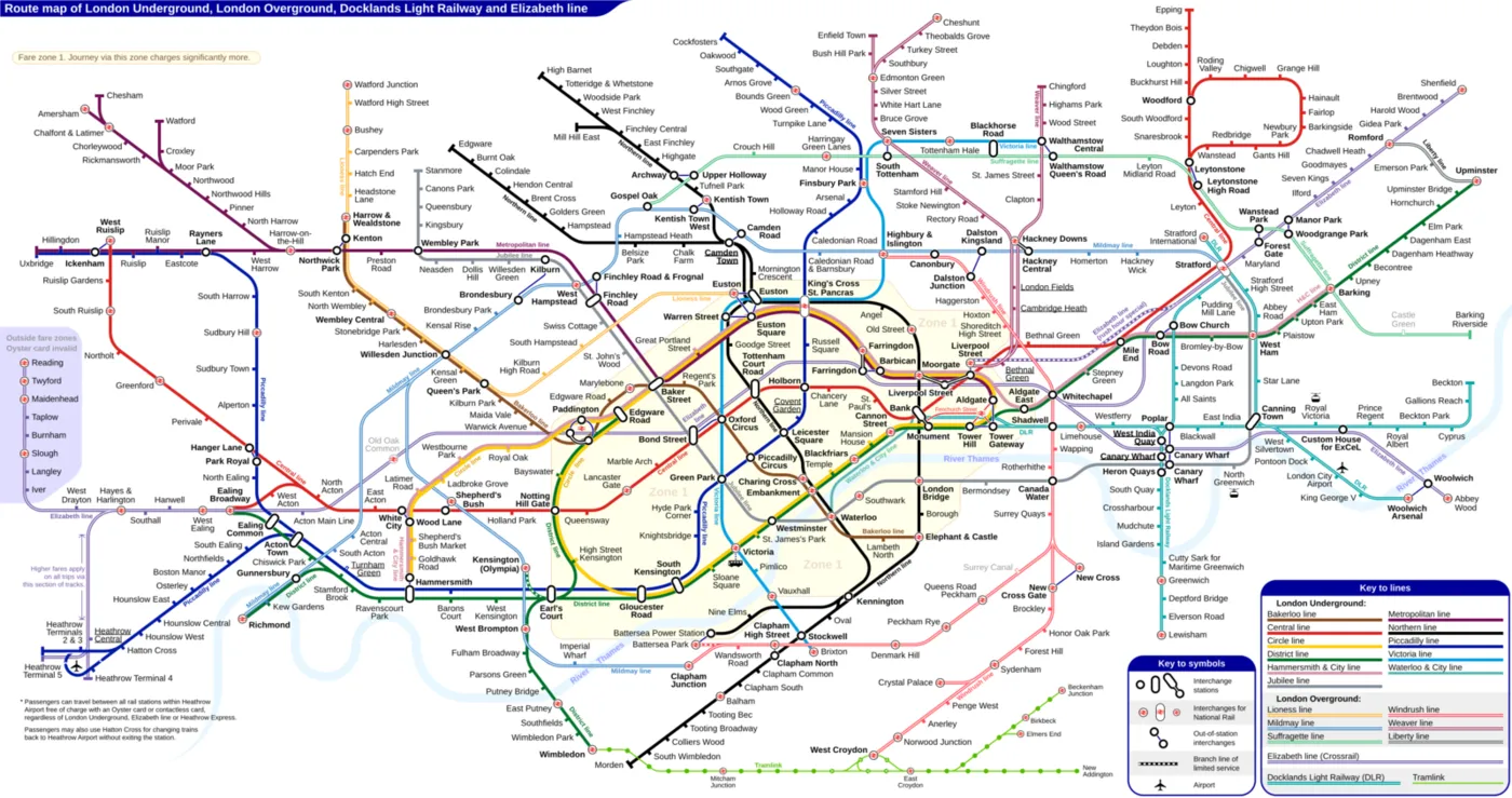
Diagrama de Sameboat · via Wikimedia Commons · CC BY-SA 4.0
The London Underground map draws an interchange in two ways. Either the lines cross at a single circle, or two circles appear joined by a stroke. Zhan Guo cross-referenced the map with 18,894 recorded journeys and showed that this drawing changes people’s routes. Stations drawn with the stroke, like Baker Street, seem harder to change at than they are, and stations drawn as a single dot, like Oxford Circus, seem easier, even with worse passageways. The model estimates that the stroke drives away hundreds of interchanges a day at Baker Street, and that the dot attracts even more at Victoria and at Oxford Circus. Two circles joined by a line say “two connected things”, and one circle says “a single thing”. People act on that reading, not on the real passageway. The drawing of the interchange changed the route of people who travel there every day, and the same thing happens with a line between two elements on a screen.
The simplest map beats the experience of those who ride the Underground
A case of the Law of Prägnanz
Diagrama de Sameboat · via Wikimedia Commons · CC BY-SA 4.0
The London Underground map reduces the city to 45- and 90-degree angles and equalised distances. That is what makes it legible, and it is also what misleads. Zhan Guo cross-referenced the map with 18,894 recorded journeys and measured how much distance on the map weighs in the choice of route compared with actual travel time. It weighs twice as much. From Paddington to Bond Street, more than 30% of passengers choose a route about 15% slower, which sets off in the opposite direction from the destination, because on the map it looks 10% shorter. For those who use the Underground five or more days a week the effect shrinks, but it remains larger than that of their own experience. The law speaks of ambiguous figures resolved by the simplest form. Here the simple form was designed, and the brain took it for the territory. When you simplify a map, a chart or a flow, the simplification comes to count for more than the reality it represents, and not even routine undoes that.
The big button subscribes; the small link declines
A case of the Salience bias
FTC · amended complaint, page 32 (Amazon interface) · Uso editorial
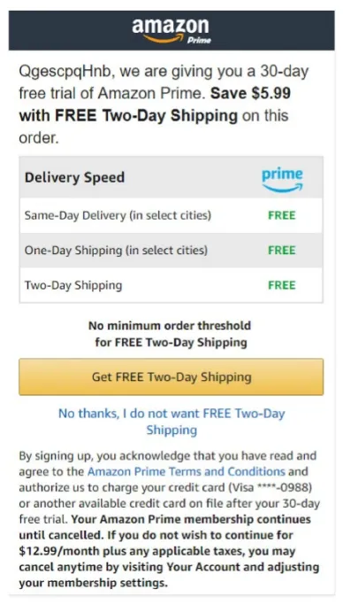
In 2023 the FTC, the United States consumer protection agency, sued Amazon for leading people to subscribe to Prime without realising it. According to the complaint, the button to complete the purchase did not say clearly that the person was signing up for the subscription, and the option to buy without signing up was a hard-to-find link, worded as a refusal of free shipping. In September 2025 Amazon settled without admitting guilt, with a one billion dollar fine and one and a half billion in refunds to about 35 million people. The order requires a clear and visible button to decline Prime. The screen descriptions are the FTC’s allegations. What the regulator prescribed was salience. Who is served by what is being highlighted?
The dashboard that declared a winner where there was only noise
A case of the Clustering illusion
Optimizely · Statistics for the Internet Age · Uso editorial
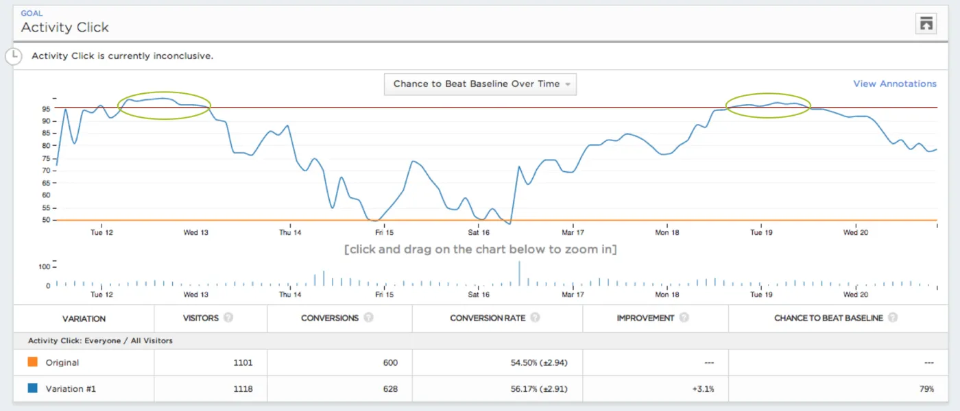
Optimizely sells A/B tests, and in 2015 it explained why it had to change the statistics in its own product. Customers watched the dashboard while the test was running and stopped as soon as one of the versions seemed to be winning. The company simulated tests in which the two versions were identical, that is, with no real difference to find. Even so, with five thousand visitors, more than 57% of those tests showed a winner or a loser at some point, if the dashboard was checked after every visitor. It is the clustering illusion in your workplace. Two curves generated by chance separate for a moment, and whoever is watching reads the separation as a pattern and the pattern as a result. The fix was to change the method, with a calculation that keeps the error at 3%. The numbers come from simulation, and the source speaks of peeking at the test, not of the clustering illusion. What interests me is that the illusion was systematic enough to demand a redesign, and that it is born on the dashboard.
The more legible typeface the road returned
A case of the Law of legibility

Foto de MPD01605 · via Wikimedia Commons · Domínio público
In 2004 the United States federal highway agency approved the Clearview typeface for dark-background signs, based on early studies that showed it to be more legible. In 2016 the same agency ended the approval. Later evaluations found no benefit in the narrower letters and found legibility worse than that of the standard alphabet, above all on light backgrounds. The explanation is on the agency’s questions page. The gains measured at the start came from the signs’ new reflective material, not from the lettering. In 2018 Congress ordered the approval reinstated, and the agency recorded that it neither recommends nor endorses the style. The case is not about screens, and it serves for that very reason, because there the variables were kept separate. Swapping only the retroreflective sheeting already yielded a 6% gain in legibility for the standard alphabet itself. The change of style on its own yielded no practical difference on dark backgrounds, and got worse on light backgrounds and in the numerals. Before choosing your product’s typeface, sort out the contrast.
The hidden menu nobody opened
A case of the Law of visibility
In 2016 Jakob Nielsen’s group measured, with 179 people on six real sites, what happens when navigation sits behind the three-line icon. On desktop, hidden navigation was used in 27% of tasks, against 48% when it was visible. On mobile, 57% against 86%. Content discovery fell by more than 20% on both platforms, and tasks were at least 39% slower on desktop. The same sections existed in both designs, and what changed was being in view. In the same year Spotify replaced the hidden menu with five fixed tabs at the bottom of the app, and told TechCrunch that clicks on menu items rose 30% and clicks in general rose 9%. The law has a cost on the other side: in 2007 Office replaced the menus with the Ribbon, put everything in view and forced whoever already knew where things were to relearn the programme.
Emotion and aesthetics
The mouse that cannot be used while it charges
A case of the Aesthetic–usability effect
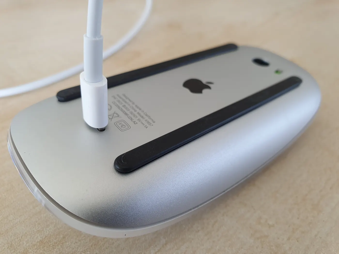
Foto de Syced · via Wikimedia Commons · CC0 1.0
Apple’s Magic Mouse has its charging port on the underside. While the cable is plugged in, the mouse lies belly-up and does not work, and its most basic operation is interrupted by the decision to keep the top surface clean. The design is an old internet joke and has stayed standing. When Apple swapped the connector for USB-C, in October 2024, the port stayed underneath. Nobody measured tolerance here, and the bridge is mine: what the effect describes is aesthetics buying patience for the functional defect, and this defect has gone through years of jokes and a change of connector without being corrected.
The exercise at the edge of what you know, and the flow with no door
A case of the Flow state
Duolingo · Introducing Birdbrain · Uso editorial
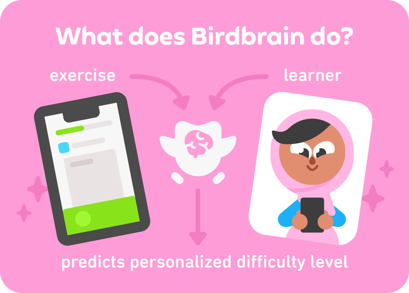
Duolingo described Birdbrain in 2020, a model that estimates what each person knows and the difficulty of each exercise, and picks what is at the right level for them. The post names both sides. Material that is too hard frustrates, too easy bores. In A/B tests, according to the company, those who received exercises chosen this way learned more and came back more the next day, and by October 2020 more than 20% of lessons were already going through the model. The magnitude was not published, only the direction. It is the central condition of flow turning into product, challenge adjusted to skill with immediate feedback. The same mechanism has a dark side, and it appeared in 2024 in internal TikTok documents that came to light in a lawsuit. The company defined the habit moment as 260 videos in the first week, which fits in under 35 minutes, and the time-limit tool reduced daily use from 108.5 to about 107 minutes. The source speaks of compulsive use, not of flow. The difference between the two products is the exit door.
The card that already came with two stamps
A case of the Zeigarnik effect
In 2004 a car wash handed out three hundred loyalty cards at random. Half asked for ten stamps to earn a wash and came with two already stuck on. The other half asked for eight and came empty. The effort was identical, eight washes. In nine months, 34% of the cards that came with the two stamps were completed, against 19% of the empty ones, and those who received them came back on average 2.9 days sooner between one visit and the next. The authors call this endowed progress and rest the effect on Bliuma ZeigarnikMeasured, in 1927, that waiters remembered the orders still open better than those already delivered. The effect bears her name.One reference in this work:1927Über das Behalten von erledigten und unerledigten HandlungenSee on Wikipedia ↗See in the bibliography →, cited right in the first of the paper’s two theoretical reasons. What I add is the framing: what holds up today is resumption, and not memory. A task presented as begun and incomplete is completed more than the same task presented from scratch. Your interface’s progress bar does not inherit this for free. A meta-analysis of 32 experiments with online questionnaires found that the constant progress bar does not reduce abandonment, and that, when there was an incentive to take part, it increased it. What retains is the task already begun, and the bar on its own does not do that work.
The one-star review weighs more than the five-star one
A case of the Negativity bias
Two Yale researchers compared, in 2003, the reviews and sales rankings of the same 2,505 books on Amazon and on Barnes & Noble, and measured how each title’s sales changed on one site when the reviews changed there. Reviews are overwhelmingly positive in both places, and even so a one-star review weighs more on sales than a five-star one. The interface shows both ratings with the same visual weight and the same scale. Whoever reads gives more weight to the negative one. The authors explain the asymmetry by credibility, because the author can commission praise and cannot prevent criticism, and I think the two explanations coexist: credibility and the greater weight the negative carries on its own. What is measured in sales is compatible with what the bias claims, and it is not proof of it, because part of the asymmetry may be credibility. A bad comment on your product is worth more than a good one of the same size, and the screen that treats them as equivalent is getting the sum wrong.
The gym that charges for not going
A case of the Temporal discounting
Two economists followed 7,752 people at three gyms in the United States, with daily attendance records, between 1997 and 2001. Those who chose the monthly contract above seventy dollars went on average 4.3 times a month and paid more than seventeen dollars per visit, when they could have paid ten with the ten-visit pass. Over the course of the membership, they missed out on saving six hundred dollars on average, and between the last visit and the cancellation an average of 2.31 paid months went by. At the moment of signing up, the person buys a future in which they go three times a week. At the moment of going, the cost of leaving the house today beats the distant benefit. The business model profits from the difference between the two moments, and the source names the two things that produce that difference, discounting of the future and overconfidence about the self-control the person will have later. Every subscription you design is betting on the same difference. It is worth knowing whether your product wins when the person uses it or when they forget to.
Memory and decision
The redesign Snap undid in six months
A case of the Jakob’s law
Snap Inc. · screenshots of the redesign, via MacRumors · Uso editorial
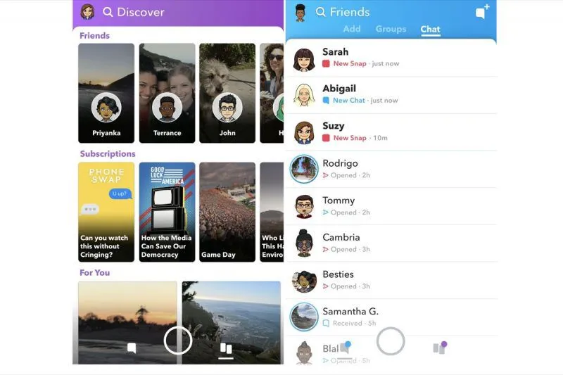
At the beginning of 2018 Snapchat launched a redesign that separated friends from creators and put friends’ Stories together with Chat, on the left-hand side of the camera. A petition asking for the previous version passed 1.2 million signatures, and the company replied that it would not go back. On the first-quarter earnings call, on 1 May, Evan Spiegel admitted that putting watching Stories and chatting with friends in the same place made it harder to optimise both behaviours, and announced that friends’ Stories would go back to the right. In August, on the second-quarter earnings call, Snap reported the first drop in daily users in its history, from 191 to 188 million, and attributed the drop to the disruption caused by the redesign. The company also reported gains, such as higher retention among new users over 35, and partly blamed performance problems on Android. The law is usually read as “look like the other sites”. Here the broken convention was the product’s own, the habit that millions of people had built inside it. Whoever redesigns a product used every day is tampering with a mental map, and the bill comes due in frequency of use.
The last one in stock, and what it doesn’t say
A case of the Scarcity bias
Two hotel screens show the same room at the same nightly rate. One says “2 rooms left at this price”, the other says nothing, and the real number is the same on both. The first converts more. If the figure is true, it merely reported something that matters to the decision. If it was fabricated, it charged an anxiety that did not need to exist. From the screen, the two are identical, and what separates one from the other is not on the screen, it is in the origin of the number. Can anyone show where it came from? The same question applies to the counter that resets when the page reloads, to the “17 people viewing right now” and to the last unit that never runs out.
Worchel; Lee; Adewole, 1975
Half a per cent that became the whole phone
A case of the Availability heuristic
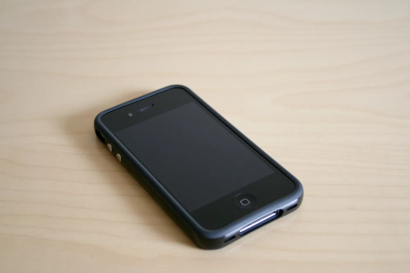
Foto de William Hook · via Wikimedia Commons · CC BY-SA 2.0
Three weeks after the launch of the iPhone 4, in 2010, with videos and headlines about the signal dropping when the phone was held by its side, Apple called a press conference. According to the numbers Steve Jobs presented, 0.55% of buyers had called support about the antenna or reception, the return rate was 1.7%, against 6% for the previous model, and the phone dropped less than one call more per hundred. Even so, Apple gave every buyer a free case. The perceived frequency of the defect did not come from the rate, it came from how easy it was to remember. A ten-second video and weeks of coverage weigh more than half a per cent. The numbers are the company’s own, chosen for the defence, and Consumer Reports had reproduced the defect in the laboratory that same week. The defect existed, and the memory of it was bigger than the defect. When your product fails in a way that is easy to tell, the rate is not going to defend you.
The sweaty hand, the high five and the test that measured
A case of the Peak–end rule
Mailchimp · illustration of Freddie, via The Next Web · Uso editorial
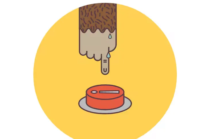
Building an email campaign is long and monotonous, and Mailchimp invested in the two points the rule predicts. On the confirmation screen, the mascot’s hand trembled over a big red button, and after sending he gave a high five. Aarron Walter, the company’s UX director at the time, described the decision as acknowledging the emotional journey of sending a campaign, anxiety before and joy after, and recorded that tens of thousands of customers shared the moment. It is anecdotal evidence, and the animation went away in later redesigns. The measurement came from a 2026 study in a vocabulary app. Sessions with four or eight words received the same rating, and the average of the best page and the last one predicted the final score much better than the average of all the pages. The same study found the limit, because improving the peak and the end together yielded less than the sum of the two. If you can only look after two moments of the flow, look after the peak and the end, without expecting the gains from the two to add up.
The “Apply” that steals the click from the main button
A case of the Von Restorff effect
Baymard Institute · Checkout UX: Avoid Apply Buttons · Uso editorial
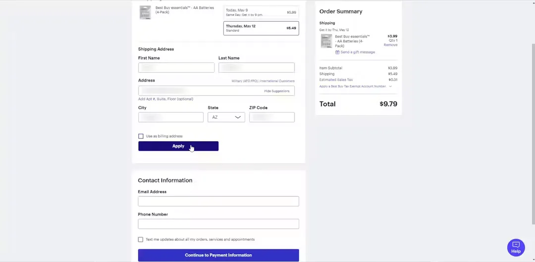
In the Baymard Institute’s checkout tests, participants confuse the “Apply” button, which applies a postcode, coupon or gift card, with the main button of the step. One of them, at Best Buy, said they were going to click Apply without knowing what it did. When Apply has the same visual weight as the button that moves forward, the person clicks it thinking they are moving forward, the page does not change as expected, and they suspect an error. In 2025, 22% of e-commerce sites still required buttons like that. It is the effect failing through an excess of candidates. Two buttons with the same emphasis, neither isolated, and the click goes to the wrong one. The opposite also happens. In tests with eye tracking, the block visually different from the rest of the page was read as an advert and ignored, and in one of the sessions the person fixated once in 132 on the block that answered their question.
The menu turned inside out
A case of the Serial position effect
Erik Runyon · Carousel Interaction Stats · Uso editorial
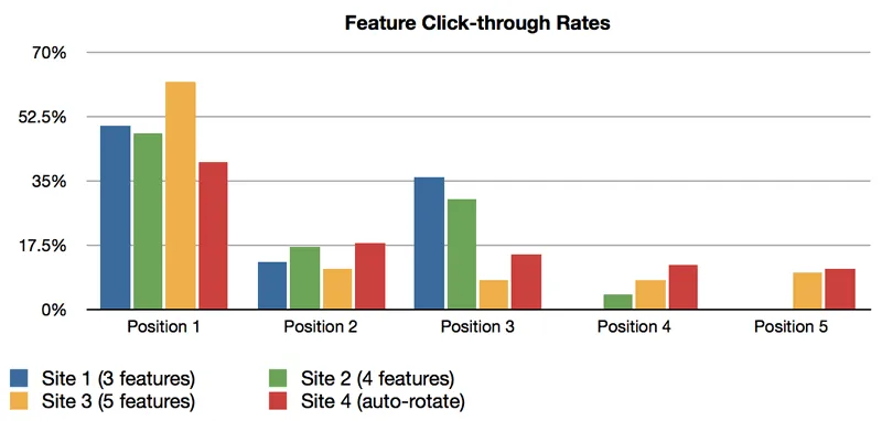
In a café in central Tel Aviv, two researchers tested two versions of the menu, which differed only in the position of the items within each category. In the inverted version, the items at the ends swapped places with those in the middle. Each version stayed for fifteen days, with 459 orders on one and 492 on the other. Items placed at the beginning or the end of their category’s list were ordered up to twice as often, and on average took 55% of the orders, versus 45% when they were in the middle, which gives a gain of about 20%. Same item, same price, same description. The authors point out that primacy and recency were described for sequential presentation, and a menu is simultaneous, so the link to an on-screen list carries the same caveat. On screen the effect has a side the menu does not have. In a carousel on the University of Notre Dame’s home page, 84% of clicks went to the first slide, and the other four split the rest. There, there is no end of list to rescue the last item.
The cancellation screen that lists what you lose
A case of the Choice-supportive bias
A month after choosing a plan, almost nobody remembers the reservations they weighed when choosing. Memory reconstructs the decision already cleared of the objections. The cancellation screen that lists everything you are about to lose works on top of that: it reactivates the good side, which memory preserved, against a present annoyance that it did not keep. The honest way round is not to remove the list, it is to balance it. Show also what the person stops paying, keep the cancel button at the same visual weight as the stay button and leave the way back open afterwards. Whoever cancels and is treated well comes back; whoever cancels and has to fight does not.
The free trial doesn’t demonstrate, it delivers
A case of the Endowment effect
In a classic experiment from 1990, half of a class received a mug, and the other half did not. Minutes later, everyone traded. Those without a mug offered about US$ 2.50 to buy one. Those who had one asked US$ 5.25 to sell theirs. It was the same object, and the price doubled just by changing hands. Almost no trades happened. That is the sum the thirty-day free trial is doing. It doesn’t show the product, it delivers the product. When the period ends, the person is not deciding whether to buy something new, but whether to give up something that was already theirs, and the two questions give different answers in the same brain. The same mechanism explains the disproportionate anger when a feature that almost nobody used disappears.
Kahneman; Knetsch; Thaler, 1990
The US$ 999 that never existed, and the crossed-out price the court crossed out
A case of the Anchoring bias
Apple · presentation of 27 January 2010, via Fortune · Uso editorial
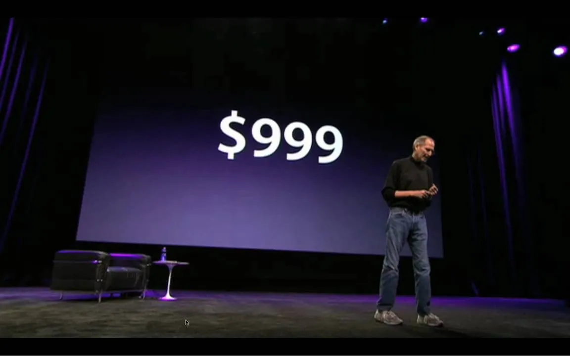
At the iPad launch, in 2010, Steve Jobs presented the price starting from the number the press had been speculating about, 999 dollars, and only then announced that it started at 499. The official press release called the device revolutionary and the price unbelievable. The first number the audience saw was not the price, and the real price was assessed against it. The case documents the presentation, not the effect on sales. What has a measurement is the fabricated anchor. In 2014 Overstock.com told investors that a California court had imposed a 6,819,000-dollar fine on it for misleading comparative pricing. The crossed-out price next to the real price was calculated by a formula over the wholesale cost, and sometimes came from a similar product, not an identical one. The company itself said that the average advertised discount was 33% and that the method the court required would take it to 26%. Those seven points are the size of the ruler the anchor was moving. A crossed-out price is an anchor, and the question that matters for your product is where the crossed-out number came from.
Social behavior and expectation
The number that convinces is not the biggest
A case of the Social proof
GoldsteinRan the hotel towel experiment, which shows that the social norm works better the closer the group cited.One reference in this work:2008A room with a viewpoint: using social norms to motivate environmental conservation in hotelsSee in the bibliography →, Robert CialdiniSystematised the principles of influence — social proof, scarcity, reciprocity — which this catalogue treats as tool and as risk.One reference in this work:2001Influence: science and practiceSee on Wikipedia ↗See in the bibliography → and Griskevicius swapped the little card asking guests to reuse their towel, in hotel rooms, and went to measure what happened to the towels. The standard card appealed to the environment. A second said that most guests of that hotel reused theirs, and a third, that most guests of that very room did. The closest group is also the smallest, and it was the one that convinced most. On a screen the criterion is the same, closeness to the reader and not the size of the number. The invented figure is tempting here and costly when discovered, because social proof is the only lever on the screen that, once disproved, contaminates everything written around it.
Goldstein; Cialdini; Griskevicius, 2008
The launch that cited Zajonc
A case of the Mere-exposure effect
When Google Drive replaced the Google Docs list, in 2012, two UX researchers at Google treated the switch as a problem of change aversion, the discomfort of seeing the familiar replaced by the unknown. In the paper they presented at CHI 2013, they cite ZajoncMeasured the mere-exposure effect: repetition without conscious recollection already increases preference.One reference in this work:1968Attitudinal effects of mere exposureSee in the bibliography → and the mere-exposure effect to explain why the old design has an advantage over the new one, until the new one is used enough to become familiar too. The launch followed a script. Warn beforehand, explain the gain, let the person switch between the new and the old version for a while and fix quickly whatever broke. The authors measured satisfaction on a seven-point scale and report a significantly more positive reception than that of other redesigns, without publishing a number. It was not a controlled experiment, and they themselves call for one. The most famous case of the same interval is Facebook’s News Feed, in 2006, which gathered 284,000 people in a protest group the day after launch and ten years later was the product. What changed between one date and the other was exposure. When you replace a screen people know, the first-day rejection is not the final result, and the interval until familiarity is what needs designing.
The screen only you know how to read
A case of the Illusion of transparency
In an experiment by Elizabeth NewtonRan, at Stanford, the experiment of tapping the rhythm of a song on a table. The tappers estimated a 50% hit rate; it came out at 2.5%.One reference in this work:1990The rocky road from actions to intentionsSee in the bibliography →, at Stanford, one person tapped out the rhythm of a well-known song on the table and another tried to guess which it was. Before starting, the tappers estimated that half would be guessed right. Out of 120 songs, the listeners got three. Whoever taps hears the whole melody in their head while tapping, and can no longer imagine what it is to hear only the taps. That experiment has a name of its own, the curse of knowledge, and it is this law’s cousin. One measures how much we think what we feel is visible; the other, how much we think what we know is available. For whoever designs, both end up in the same place. It is what happens when you present your own flow thinking it is obvious. You are hearing the song, and whoever is going to use it has only the taps. The label that seems clear, the icon that seems self-evident and the step that seems natural only seem so to whoever already knows the tune. That is why the test with someone who has never seen the screen is not an optional step.
Newton, 1990
The quiz where the host looks smarter
A case of the Fundamental attribution error
RossNamed the fundamental attribution error and ran the quiz game experiment in which the randomly assigned advantage vanishes from the judgement.2 references in this work:1977The intuitive psychologist and his shortcomings1977Social roles, social control, and biases in social-perception processesSee in the bibliography →, Amabile and Steinmetz randomly assigned students to two roles: who would ask the questions and who would answer. The questioners wrote their own questions, free to pick subjects they knew well. Afterwards, those who answered rated the general knowledge of both, and in a second experiment those who only watched did the same. Contestants and observers rated the questioners as far better informed; the questioners themselves did not give themselves that advantage, because they knew where it came from. Everyone had seen the draw. Everyone knew the questions were chosen by whoever asked them. And even so the structural advantage vanished from the judgement of those on the other side of it, and what was left was a reading of the person. It is exactly what happens in the meeting where someone says the user “didn’t read it”. The asymmetry of context disappears and the judgement of character remains.
Ross; Amabile; Steinmetz, 1977
The “not interested” button that has almost no effect
A case of the Illusion of control
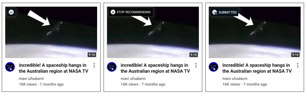
Mozilla Foundation · Does This Button Work? · Uso editorial
In 2022 Mozilla measured whether YouTube’s controls do what they promise. More than 22,000 people donated data through a browser extension, in a controlled experiment in which a stop-recommending button sent YouTube one of the official signals, or nothing. The “don’t recommend channel” button prevented about 43% of unwanted recommendations. “Remove from history” prevented 29%, “dislike” 12% and “not interested” 11%. Not even the most effective control prevents half, and people notice. In the qualitative part, they say using the controls changes nothing, and some watch logged out or through a VPN to get any effect. It is the reverse of the classic bias, in which the person overestimates the control they have. Here they underestimate it, and rightly so. Mozilla is an interested party, and the percentages hold as a comparison between groups. The case shows the cost of a button that promises more than it delivers. Once the gap is discovered, it contaminates trust in every other control.
About the work, not about who uses it
The three boxes that held back US$894 million
A case of the Tesler’s law

S.D.N.Y. · ruling of 16 February 2021 (Flexcube interface, Oracle) · Uso editorial
In August 2020 Citibank wanted to pay about US$7.8 million in interest to the lenders on a Revlon loan. In the system the operation used, any payment goes out as a transfer unless the operator overrides that default, and to hold back the principal three cryptically named fields had to be ticked. The operator ticked one. The reviewer and the approver agreed that was enough. The final screen warned that the funds would leave the bank and asked whether to continue, without saying how much. US$893,944,008.52 went out on top of the interest. The complexity of not sending the money stayed entirely with those operating it, and three experienced people made the same mistake, which is what the law predicts when the system absorbs nothing. The first court ruling, in 2021, let the lenders keep the roughly US$500 million they refused to return; the appeals court reversed it in 2022 and the bank recovered the money.
In re Citibank August 11, 2020 Wire Transfers, S.D.N.Y., 2021
Five commands in a third of Word
A case of the Pareto principle
In 2006 Jensen Harris published the usage data for Word 2003, collected from those who agreed to take part in Microsoft’s telemetry. The five most used commands, Paste, Save, Copy, Undo and Bold, accounted for about 32% of all use, and Paste alone for more than 11%, twice the second. The data changed a decision. The team was considering removing the copy and paste buttons from the new interface, because everyone knew people used the keyboard shortcut, and the data showed that the Paste button was the most clicked of all. It became the first big button on the first tab. The same post records what the principle does not authorise. After the first ten commands the curve flattens, and the difference in use between the hundredth and the four-hundredth is similar to the difference between the first and the eleventh. People use a lot of the product’s breadth. Telemetry says what deserves prominence, and it does not authorise cutting the rest.
The switch between Lite and Pro, and the path that sat idle for ten years
A case of the Flexibility and efficiency of use
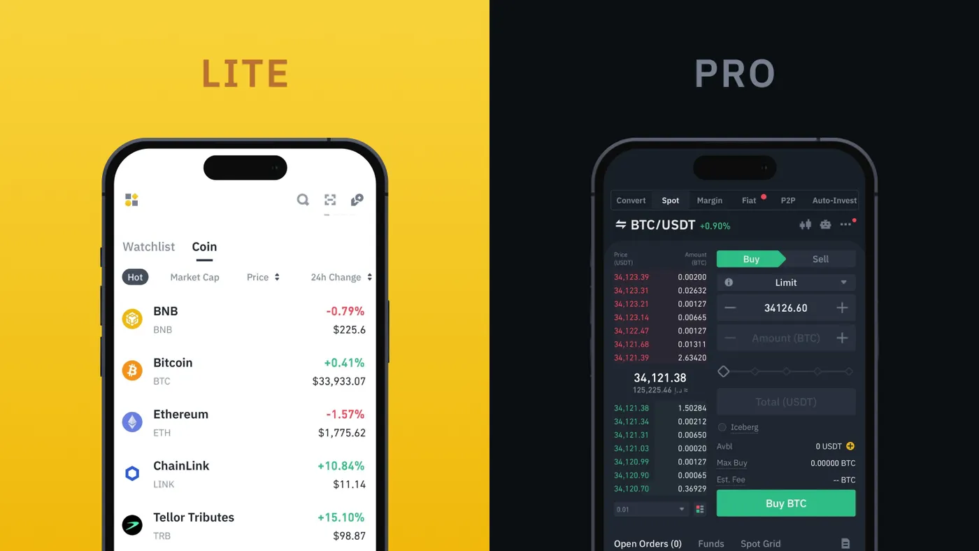
Binance · Unpacking Binance Lite and Pro · Uso editorial
The Binance app has two modes for the same account and the same balance. Lite is the default, reduces the information on screen and is there to check a price and buy or sell. Pro is the full platform, with the tools of someone who trades all day. Switching is a toggle in the profile, and neither mode demands anything of those who do not need it. The company does not publish results. The other side of the heuristic shows when the second path stops keeping pace with the first. Gmail kept a basic HTML version for years, built for slow connections and old browsers, and used by blind people because it worked better with screen readers. In 2023 Google announced it would shut it down, on the grounds that that version had been superseded more than ten years earlier. The alternative path went a decade without maintenance and was switched off on top of the people who depended on it most. Offering two paths means taking on two maintenance jobs.