lei
Law of Prägnanz
Perceptual organisation will always be as “good” as the prevailing conditions allow.
If the screen does not explain itself as a wireframe, colour is not going to fix it.
Prägnanz means something like “good form”, and KoffkaWrote the treatise that consolidated Gestalt, from which come proximity, similarity, continuity and good form.One reference in this work:1935Principles of Gestalt psychologySee in the bibliography → admitted in his own book that the word went undefined. The later tradition read good form as the simplest interpretation that accounts for the image, and that is the useful reading for whoever draws screens. It is the reason you see two overlapping circles instead of a cut-out figure with a strange outline. For whoever designs, this works as a test: if the screen’s structure does not survive being seen from afar, blurred or as a raw wireframe, it is not resolved in its form. It is being held up by colour, text or detail, which are the layers the person reads afterwards.
What the brain does with it
The biological mechanism behind the effect, and how much of it was actually measured.
The principle describes a regularity of perception: faced with an ambiguous stimulus, the visual system converges on the interpretation with the lowest descriptive load, the one that needs the least information to be specified. That is a computational formulation, not an anatomical one, and it is what makes it testable. It is one of two readings that have been in dispute for decades, and the other says the system picks the most probable interpretation in the world we live in, not the most economical to describe. In the classic figures the two predictions coincide, and that is why the dispute has not ended. The stage at which this organisation happens is known, V1The first area of the brain, right at the back of the head, to receive what the eye sent. It is where the image becomes contrast, edge and orientation, before you recognise what you are looking at.See it in Senses and attention →See in the glossary → and V2The area right after V1. It joins the edges V1 detected, separates figure from ground and decides which elements form a group, all of it before you notice you looked.See it in Senses and attention →See in the glossary →, where the visual cortex groups and segregates before the person reports what they saw, as RoelfsemaOne reference in this work:2006Cortical algorithms for perceptual groupingSee in the bibliography → reviewed in 2006. No known structure implements the preference for the simplest form, and speaking of the “effort” or “overload” of a visual area is metaphor, not measurement. The link between those areas and good form is my bridge.
The body this law presumes
Who it was measured on, and what changes when the body on the other side is another.
The law describes what the eye does with form, and that holds for whoever sees the screen. For whoever navigates by screen reader there is no form to simplify, and the same question moves elsewhere. Instead of asking whether the screen explains itself as a wireframe, ask whether it explains itself in the heading tree.
How design translates it
What to do with it on a screen, without turning a finding into a rule.
How to measure this in your product
A fragmented interface, with a confusing text hierarchy and scattered fields, forces the person to look for an outline where there should be form. The test is simple and fits into any review: reduce the screen to a wireframe, strip out colour, text and icons, and look from afar. If the structure still communicates what is a heading, what is a group and what is an action, good form is there. If only colour was holding it together, the problem shows up in the review and not in use.
Where it breaks
Where the law does not hold, holds less, or holds in reverse.
The brain simplifies by the cheapest route, not the most correct one. An ambiguous form will always be resolved, just not necessarily the way you intended.
Um caso
A real product where this showed up, with what happened and where to check it.
The simplest map beats the experience of those who ride the Underground
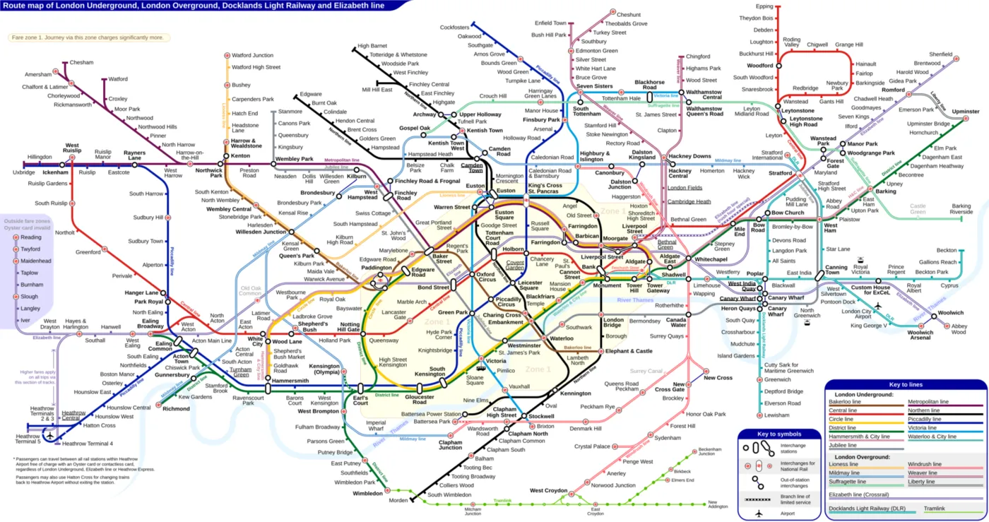
Diagrama de Sameboat · via Wikimedia Commons · CC BY-SA 4.0
The London Underground map reduces the city to 45- and 90-degree angles and equalised distances. That is what makes it legible, and it is also what misleads. Zhan Guo cross-referenced the map with 18,894 recorded journeys and measured how much distance on the map weighs in the choice of route compared with actual travel time. It weighs twice as much. From Paddington to Bond Street, more than 30% of passengers choose a route about 15% slower, which sets off in the opposite direction from the destination, because on the map it looks 10% shorter. For those who use the Underground five or more days a week the effect shrinks, but it remains larger than that of their own experience. The law speaks of ambiguous figures resolved by the simplest form. Here the simple form was designed, and the brain took it for the territory. When you simplify a map, a chart or a flow, the simplification comes to count for more than the reality it represents, and not even routine undoes that.
Experimente
A piece to check in your own body what the text has just claimed.
How many shapes are you seeing?
Look at the figure and count the shapes before touching anything. Then pull the pieces apart and check whether that was really it.
Count the shapes before pulling them apart.
The brain does not return what is on the screen: it returns the simplest interpretation compatible with what is on the screen. That is an enormous saving and it is also what makes an ambiguous layout be read with confidence, and wrongly. When the simplest reading of a screen is not the one you meant, whoever reads fast walks away with the wrong reading, however correct the alignment may be.
Neighbouring concepts
Structures linked by a bridge of my own
Sibling concepts
Fontes
Enunciado citado de Koffka, 1935.
- KOFFKA, K. Principles of Gestalt psychology. New York: Harcourt Brace, 1935. DOI
Leitura complementar: Law of Prägnanz Laws of UX em inglês