lei
Law of similarity
The human eye tends to perceive elements similar in colour, shape or texture as part of the same group, even if they are separated.
The same visual treatment means the same function, even if the elements are far from each other.
Similar-looking elements are read as if they did the same thing, even when nothing says so. Two buttons with the same colour and the same shape become, in the eyes of whoever arrives, two actions of the same kind. The reverse also holds, and it is the most common mistake: when items from the same family are drawn in different ways, the person infers a difference in function that does not exist. Whoever arrives reads the appearance before the label, and acts on what it promises.
What the brain does with it
The biological mechanism behind the effect, and how much of it was actually measured.
The V1The first area of the brain, right at the back of the head, to receive what the eye sent. It is where the image becomes contrast, edge and orientation, before you recognise what you are looking at.See it in Senses and attention →See in the glossary →, V1, has columns of neurons that respond to specific orientations, and that is solid. But grouping by similarity happens further along, in the occipitotemporal areas that represent shape and colour as properties of an object. The common explanation in popular material is that neurons that fire together mark the same object. That hypothesis exists in the literature, has been contested for two decades and is not consensus. The perceptual effect is robust, and the mechanism is not settled.
The body this law presumes
Who it was measured on, and what changes when the body on the other side is another.
Grouping by colour fails for whoever cannot tell hues apart, and WCAG treats that as a requirement, not a preference: colour can never be the only way of saying something. The figure that gets repeated at this point — 8% of men — also presumes a body. It comes from populations of northern European ancestry; AlmustanyirSurveyed the prevalence of colour blindness by region and ancestry, and his is the figure showing that the famous “8% of men” holds for one population, not for all.One reference in this work:2025A global perspective of color vision deficiency: awareness, diagnosis, and lived experiencesSee in the bibliography →’s global survey measures 9.2% among Russian men, 4% among Japanese men, 2.2% in Durban and 1.7% in Congo. The statistic the designer uses to defend accessibility depends on the population measured. And the threshold at which two colours become the same colour is not fixed. WinawerCompared Russian and English speakers telling blues apart. The Russians were faster, and the advantage vanished under a concurrent verbal task.One reference in this work:2007Russian blues reveal effects of language on color discriminationSee in the bibliography → and colleagues measured Russian speakers, a language that separates two blues that Portuguese merges into one. They distinguish two blues that fall into different Russian categories faster than two blues from the same category, an advantage that English speakers do not have with the same stimuli and that vanishes when the person does a verbal task at the same time. Grouping by shape, by weight or by position survives intact.
How design translates it
What to do with it on a screen, without turning a finding into a rule.
How to measure this in your product
For “Save” and “Submit” to be read as actions of the same level, it is enough that they share colour, shape and border treatment, even if they sit in opposite corners of the screen. The reverse is also a tool, and it is where most mistakes happen: if “Delete” looks the same as “Save”, the person expects the same kind of consequence, and the appearance promised what the button does not deliver.
Where it breaks
Where the law does not hold, holds less, or holds in reverse.
If everything gets the same visual treatment, everything becomes the same group and the hierarchy disappears. Too much similarity leaves the person with no cue as to where to start.
Um caso
A real product where this showed up, with what happened and where to check it.
The drill and the real alert on the same list
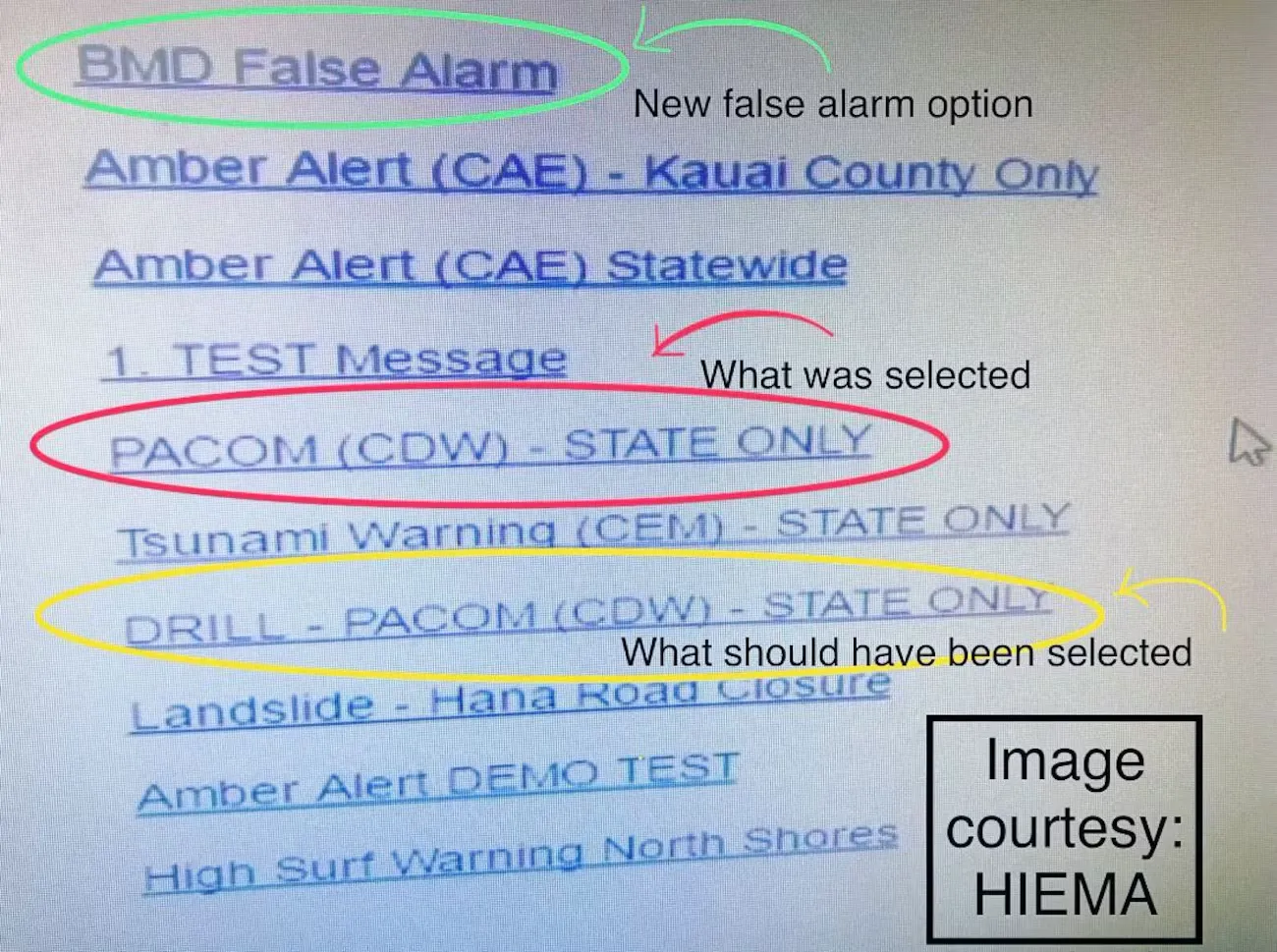
HI-EMA · image released by the state, via Hawaii News Now · Uso editorial
On 13 January 2018, an operator at Hawaii’s emergency management agency sent the entire state a ballistic missile alert during an internal drill. The FCC report describes the screen. The real alert template sat on the same drop-down list as the test template, with the same appearance, and the confirmation that followed only asked whether they were sure, with the same message for both cases and without showing the text that would go out. The FCC compares this with what other vendors do to separate test from production, such as a watermark, a different colour and a real environment hosted separately. The agency attributes the episode to human error combined with inadequate safeguards, and the interface was one of the safeguards that were missing. Two options that look the same promise the same consequence. When the consequence is the opposite, similarity makes the operator pick the wrong line, which is what happened here.
Experimente
A piece to check in your own body what the text has just claimed.
What looks alike stays together, even when apart
The spacing of this grid is uniform and never changes — neither between rows nor between columns. Choose which attribute varies and notice that the grouping appears all the same.
Nothing varies: the grid looks uniform, with no group at all.
Notice that shape and size also group, though less than colour, which tends to be the strongest similarity cue. The two carry the information on their own, and that is why all three are here. An interface that groups only by hue groups nothing for whoever cannot tell that hue apart; the same information needs to appear in shape, size or text as well.
Neighbouring concepts
Structures linked by a bridge of my own
Sibling concepts
Fontes
Enunciado formulated by Wertheimer, 1923, and consolidated by Koffka, 1935. The sentence is the current wording in the field, not a literal quotation from either.
- KOFFKA, K. Principles of Gestalt psychology. New York: Harcourt Brace, 1935. DOI
- WERTHEIMER, M. Untersuchungen zur Lehre von der Gestalt II. Psychologische Forschung, v. 4, p. 301-350, 1923. DOI
Leitura complementar: Law of Similarity Laws of UX em inglês