efeito
Aesthetic–usability effect
Users often perceive aesthetically pleasing design as more usable design.
Do not refine the aesthetics before validating the concept, the finish hides the defect.
A beautiful screen seems to work better than it does. Masaaki KurosuMeasured, with Kashimura, that prettier screens are judged easier to use even when they are not. The aesthetic–usability effect.One reference in this work:1995Apparent usability vs. inherent usabilitySee in the bibliography → and Kaori Kashimura showed this in 1995 by asking 252 people to rate 26 ATM layouts: how easy each one seemed to use tracked closely how beautiful it seemed, and far less how much it actually required fewer operations. Nobody got to use the machines, and what was measured was judgement. That has a good side, the finish buys patience for small defects, and a side that gets in the way of the work, because beauty hides the defect from whoever is testing too. It is the strongest argument for validating the concept before refining the aesthetics, and not after.
What the brain does with it
The biological mechanism behind the effect, and how much of it was actually measured.
The effect is behavioural, and what it describes is judgement: more beautiful screens tend to be judged easier to use. That is not a closed consensus, and the result changes when someone manipulates both things on purpose instead of correlating judgements. TuchOne reference in this work:2012Is beautiful really usableSee in the bibliography → and colleagues built four versions of a shop in 2012, crossing high and low aesthetics with high and low usability, and found no effect of aesthetics on perceived usability. What they found was the reverse path, with usability changing perceived aesthetics after use. The explanation with the most support is cognitive, and not anatomical, and it has a name, processing fluency. What the visual system processes with less effort is felt as easier, and that feeling is attributed to the object instead of to the processing itself. RuiReviewed the EEG and fMRI studies on aesthetic processing in interfaces, which hold up the Emotion and aesthetics page.One reference in this work:2021A review of EEG and fMRI measuring aesthetic processing in visual user experience researchSee in the bibliography → and Gu reviewed what EEG and fMRI have already measured about aesthetic judgement of interfaces, so brain imaging on the subject exists. What nobody has measured with imaging is the dissociation that gives the effect its name, beauty pulling perceived usability away from measured usability. Judging a screen as beautiful is assigning value, and valuation shows up consistently in the ventromedial prefrontal cortexIt makes the global judgement, the final opinion on an entire experience, not on each moment of it. It is because of it that the person sums up a ten-screen flow in a single sentence.See it in Emotion →See in the glossary → and in the ventral striatumPart of the reward circuit that tallies gain and loss. It reacts more strongly to losing than to gaining the same amount — the asymmetry behind a good part of the decision biases in this catalogue.See in the glossary →, in a survey of 206 imaging studies (BartraOne reference in this work:2013The valuation system: a coordinate-based meta-analysis of BOLD fMRI experiments examining…See in the bibliography →, McGuire and Kable, 2013). The link between those structures and this effect is mine.
The body this law presumes
Who it was measured on, and what changes when the body on the other side is another.
The easy assumption is that, without a screen, there is no aesthetics, and that the effect would therefore have nowhere to happen. SharifMeasured Fitts’s law in the same 55 people on two different days, with and without fine motor limitation, and it came out statistically different in the two groups. His too is the count of what it costs to read a chart through a screen reader, and the test of which sounds work best for that reading.3 references in this work:2020The reliability of Fitts’s law as a movement model for people with and without limited fin…2021Understanding screen-reader users’ experiences with online data visualizations2022“What makes sonification user-friendly?”: exploring usability and user-friendliness of son…See in the bibliography → and colleagues went to measure it in 2022 with ten screen reader users, asking them to rate the sound responses of a chart on four scales. Pleasantness was the only scale that varied significantly with the type of sound, and the one that pleased most was the choppy one, square wave. Confidence went in the same direction and clarity in the opposite, better with the sawtooth, but in those two the difference did not pass the statistical test, and the authors themselves say so. It stands as a hint, not a result: what sounds better may not be what is understood better, and that is the dissociation the effect describes, in an interface with no image at all. One step is missing before calling it proof, because nobody has yet compared measured performance against judgement in the same task. And “beautiful” remains cultural before it is perceptual, because white is mourning across much of the East and weddings in the West, and the same screen changes meaning when it crosses the border.
How design translates it
What to do with it on a screen, without turning a finding into a rule.
How to measure this in your product
The tolerance that aesthetics buys has a limit. If an essential button is hidden, the clash between aesthetic expectation and functional frustration reinforces the negative memory. There is an inverted and little-explored use: not refining the screens aesthetically while the concept is being tested, so that the finished look does not contaminate the usability test. The same goes for internal presentations, where beautiful slides mask errors and lead to bad decisions.
Where it breaks
Where the law does not hold, holds less, or holds in reverse.
The same effect makes a beautiful, bad product pass the evaluation, and the defect only shows up later, when someone has to use it every day.
Related neuromyths
What gets said about this concept out there, and what the evidence actually shows.
-
Dopamine is the pleasure molecule: a beautiful interface releases dopamine.
dopamineThe chemical signal of reward and anticipation. It is not the molecule of pleasure, but of “worth seeking”, which is why expectation usually pulls more behaviour than delivery does.See it in Emotion →See in the glossary → encodes prediction error: it rises when something is better than expected, falls when it is worse, stays neutral when it is exactly as predicted. It moves towards, more than it makes you like. Faced with “this feature releases dopamine”, the useful question is: compared with which expectation?
-
Colours have a universal psychological effect: blue conveys trust, red creates urgency.
The reported effects are small, depend on context and culture, and do not replicate consistently. What works robustly is contrast and consistency of meaning within your own product, which you define, and do not inherit from a table.
Um caso
A real product where this showed up, with what happened and where to check it.
The mouse that cannot be used while it charges
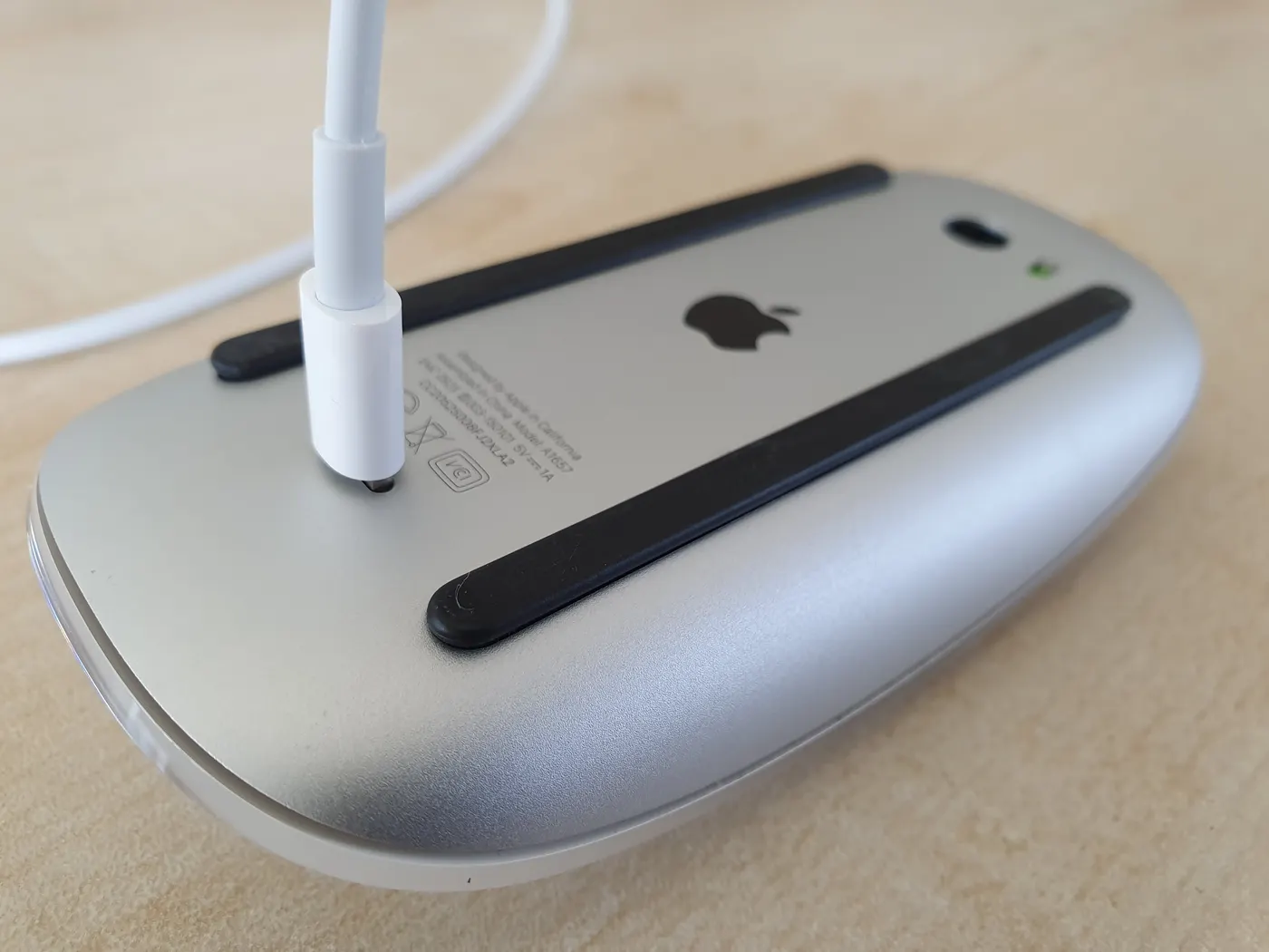
Foto de Syced · via Wikimedia Commons · CC0 1.0
Apple’s Magic Mouse has its charging port on the underside. While the cable is plugged in, the mouse lies belly-up and does not work, and its most basic operation is interrupted by the decision to keep the top surface clean. The design is an old internet joke and has stayed standing. When Apple swapped the connector for USB-C, in October 2024, the port stayed underneath. Nobody measured tolerance here, and the bridge is mine: what the effect describes is aesthetics buying patience for the functional defect, and this defect has gone through years of jokes and a change of connector without being corrected.
Experimente
A piece to check in your own body what the text has just claimed.
Which of the two is easier to fill in?
Two sign-up forms. Fill in a bit of each, however you like, and choose the one that felt easier. Then reveal the difference between them.
Both have the same three fields, the same labels, the same order and the same button. The only difference is the finish. When B seems easier, what was measured was the finish together with the flow, and that is what happens in every test done on a pretty prototype: both go into the same score, and nobody knows how much belongs to each.
Neighbouring concepts
Structures linked by a bridge of my own
- ventral striatum
- ventromedial prefrontal cortex
Sibling concepts
Fontes
Enunciado citado de Kurosu; Kashimura, 1995.
- KUROSU, M.; KASHIMURA, K. Apparent usability vs. inherent usability. CHI ’95 Conference Companion, p. 292-293, 1995. DOI
Leitura complementar: Aesthetic-Usability Effect Laws of UX em inglês