heurística
Flexibility and efficiency of use
Shortcuts that are invisible to beginners speed up those who have already mastered the system, and make it possible to serve both without choosing between them.
Offer the guided route and the shortcut, not a middle ground that serves neither.
Someone opening a screen for the first time and someone who has used it for two years do not want the same thing. The first needs signposting, declared steps and the chance to make mistakes without damage. The second wants to reach the end in three keystrokes. The common mistake is to serve the average of the two, and the average is nobody: it ends up too guided for those in a hurry and too raw for those who have just arrived. The way out is to offer both routes and leave the choice to whoever is using it. NielsenWrote the ten usability heuristics and created the heuristic evaluation method that this site treats as triage, not as a test.4 references in this work:199410 usability heuristics for user interface design2000End of Web Design2009Short-term memory and web usability1990Heuristic evaluation of user interfacesSee in the bibliography → called the shortcuts accelerators and asked that they stay hidden from those who do not need them, so the default screen stays simple, and speed remains available to whoever goes looking for it.
What the brain does with it
The biological mechanism behind the effect, and how much of it was actually measured.
Heavy users operate through sequences that no longer require deliberation, and the migration is well known: while the sequence is being learned it consumes prefrontal cortexThe region behind the forehead, where the person decides, plans and sustains attention. It keeps one thing in focus at a time and inhibits the rest: it is where the bottleneck of conscious decision usually tightens.See it in Memory →See in the glossary →; once repeated enough, it comes to depend on the circuits linking cortex and basal gangliaTogether with the cerebellum, they store what the body learned to do without thinking: typing, swiping, reaching an icon. It is the memory that survives distraction.See it in Memory →See in the glossary →, and runs with little conscious supervision. That is why a keyboard shortcut becomes faster than a menu, and why moving an element hurts more for those who use it most. The automatism does not update by notice, only by fresh repetition. This was measured in motor sequence learning, not in people using a keyboard shortcut, and the link to the heuristic is mine.
Why this law presumes no body at all
Who it was measured on, and what changes when the body on the other side is another.
Offering the guided path and the direct one is an architecture decision, not a claim about people. Who picks which varies, and the choice says more about how much the person has already used it than about the person.
How design translates it
What to do with it on a screen, without turning a finding into a rule.
How to measure this in your product
Offer both routes instead of a middle ground that serves no one. Each person chooses the pace that fits what they already know. Cryptocurrency exchanges do this literally: the same purchase exists on a screen with two fields and on a panel with a candlestick chart, order book and order type. It is the same operation, and the person chooses how much of the machine they want to see.
Where it breaks
Where the law does not hold, holds less, or holds in reverse.
Two routes cost two maintenance jobs. When the advanced mode stops keeping pace with the simple one, the people who use the product most end up with the outdated version.
Related neuromyths
What gets said about this concept out there, and what the evidence actually shows.
-
It takes 21 days to form a habit.
The number came from a 1960s clinical observation of patients getting used to their own appearance after surgery, not from a study of habit. The real measure ranges from eighteen to more than two hundred and fifty days, depending on the person and the behaviour.
-
Digital natives learn interfaces by intuition and have no need of a guided path.
Early exposure changes the repertoire, not the apparatus. Studies with young people show performance as dependent on instruction as that of any other group. Designing without the guided path because of the audience’s age is deciding by stereotype.
Um caso
A real product where this showed up, with what happened and where to check it.
The switch between Lite and Pro, and the path that sat idle for ten years
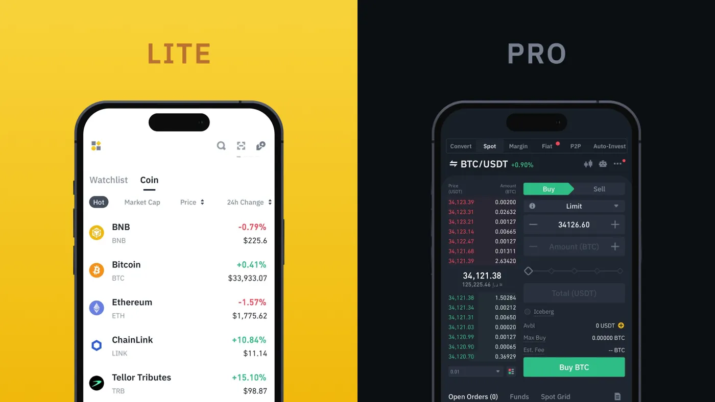
Binance · Unpacking Binance Lite and Pro · Uso editorial
The Binance app has two modes for the same account and the same balance. Lite is the default, reduces the information on screen and is there to check a price and buy or sell. Pro is the full platform, with the tools of someone who trades all day. Switching is a toggle in the profile, and neither mode demands anything of those who do not need it. The company does not publish results. The other side of the heuristic shows when the second path stops keeping pace with the first. Gmail kept a basic HTML version for years, built for slow connections and old browsers, and used by blind people because it worked better with screen readers. In 2023 Google announced it would shut it down, on the grounds that that version had been superseded more than ten years earlier. The alternative path went a decade without maintenance and was switched off on top of the people who depended on it most. Offering two paths means taking on two maintenance jobs.
Experimente
A piece to check in your own body what the text has just claimed.
Walk the three paths to the same transfer
Transfer R$ 250 to Ana, in all three designs. Tap each track to move one step and go all the way — the tap count sits beside it.
Guided 0/5
Serves those who transfer once a month and want to check each step before letting the money go.
Middle ground 0/3
Serves neither well: it is still long for those with practice, and already too short for those who wanted to check.
Advanced 0/1
Serves those who transfer every week, already know the name by heart and treat the check as friction.
Five taps on one side, one on the other. The same transfer.
The middle ground is the way out that looks reasonable and is the only one nobody asked for. Offering both extremes costs two maintenances. When the advanced mode stops keeping up with the simple one, whoever uses the product most ends up with the outdated version.
Neighbouring concepts
Structures linked by a bridge of my own
Sibling concepts
Fontes
Enunciado citado de Nielsen, 1994.
- NIELSEN, J. 10 usability heuristics for user interface design. Nielsen Norman Group, 1994. Source
Leitura complementar: The Edge Cases that Break Hearts (And Products) NN/g em inglês
Vizinho, não canônico: trata de projetar para cenários tidos como exceção, o que é próximo mas não idêntico à estratégia dos dois extremos.